Target Fetch
Using IoT to reorder household products
Problem
Subscriptions are one tactic to keep essentials like toiletries and cleaning supplies in stock, but since delivery happens on a fixed schedule, it’s easy to end up with too little or too much. Enter Target Fetch, a service that leverages smart devices to measure the stock of select essentials as they’re being used, triggering a reorder at the right time.
Role
As Lead UX Designer, I defined the information architecture of the Fetch app to support a variety of devices in tracking, reporting, and reordering essentials. I informed the product strategy through my contributions to the planning, execution, and analysis of qualitative research. On the tactical side, I designed the app’s user flows, interface, and content, collaborating with the product owner and engineers throughout the process to align on features and scope.
Background
We did exploratory research to understand how and why people use subscriptions to manage their essentials. Three primary goals emerged:
Goals of subscription users
- Replenish inventory
- Reduce unplanned trips to the store
- Offload the cognitive burden of tracking a shopping list
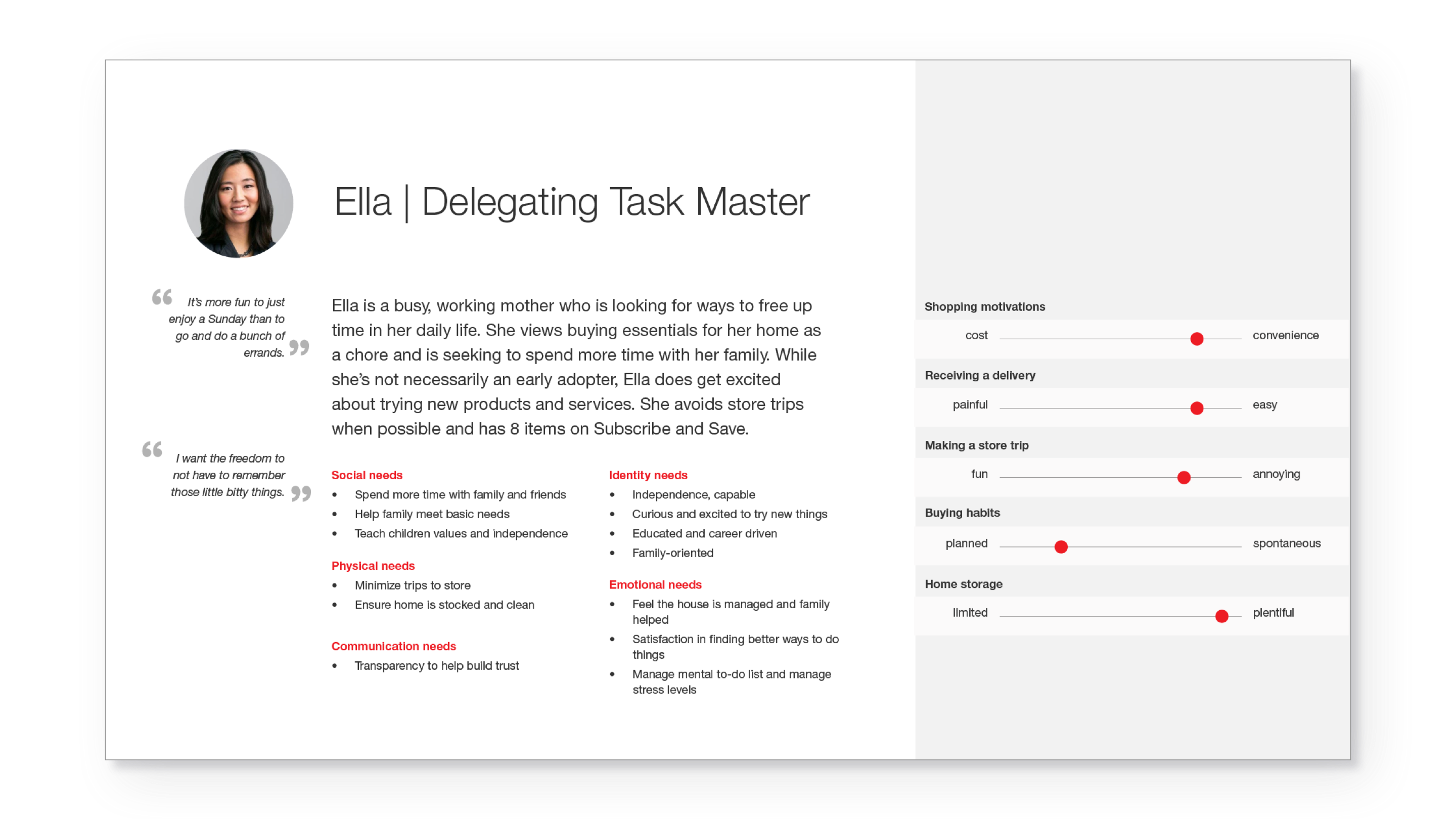
Although subscriptions helped people accomplish the first and second goals, many reported closely monitoring their inventory and subscriptions so that they could stop shipments that arrived too soon. In short, the task of tracking a list had been replaced with the task of managing a subscription. This group inspired our primary persona, and we believed that use-based subscriptions could offer ease and peace of mind.
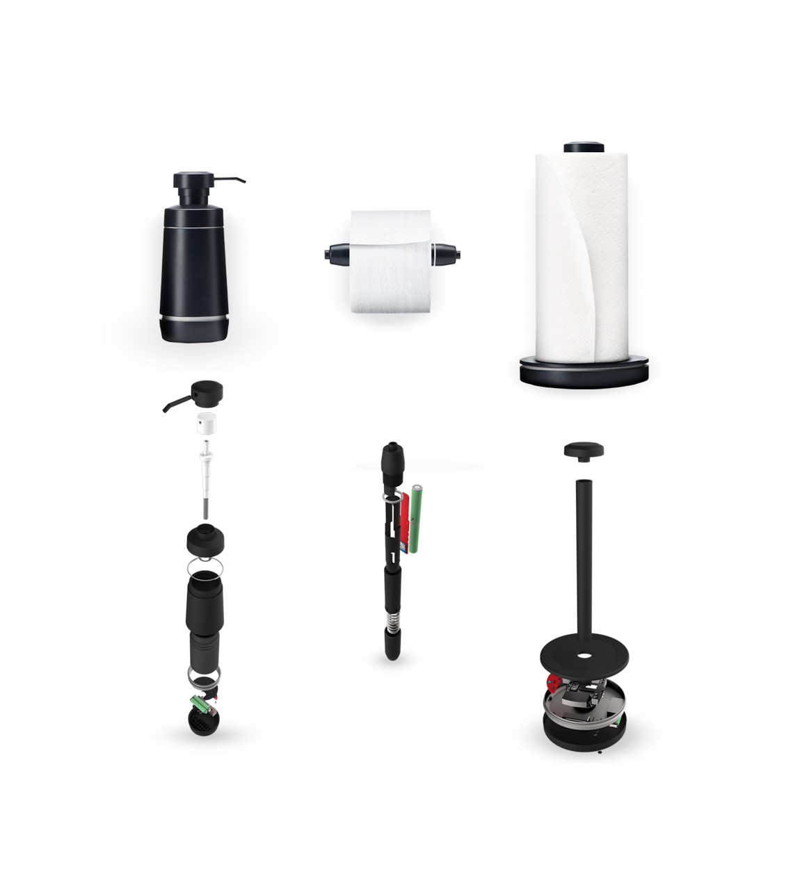
Fetch’s three hero devices—smart versions of a paper towel holder, a toilet paper spindle, and a liquid soap dispenser—are designed to be self-sufficient and natural extensions of the home. Sensors inside each device measure the corresponding essential as it is used and report this information to the Fetch app.
Let’s look at how the Fetch app handles devices, products, inventory, and reporting. Note: The Fetch platform supports third-party device integrations, but for the sake of simplicity, I'm going to focus on the Fetch hero devices.
Devices
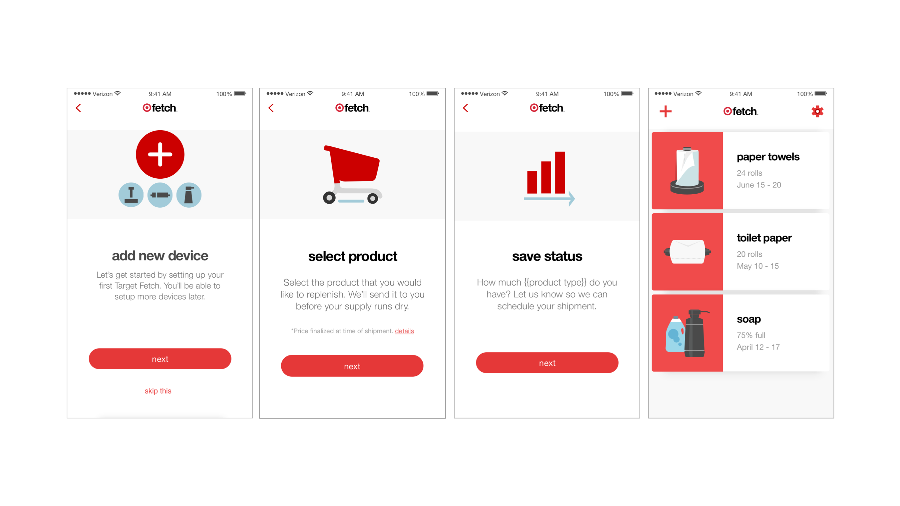
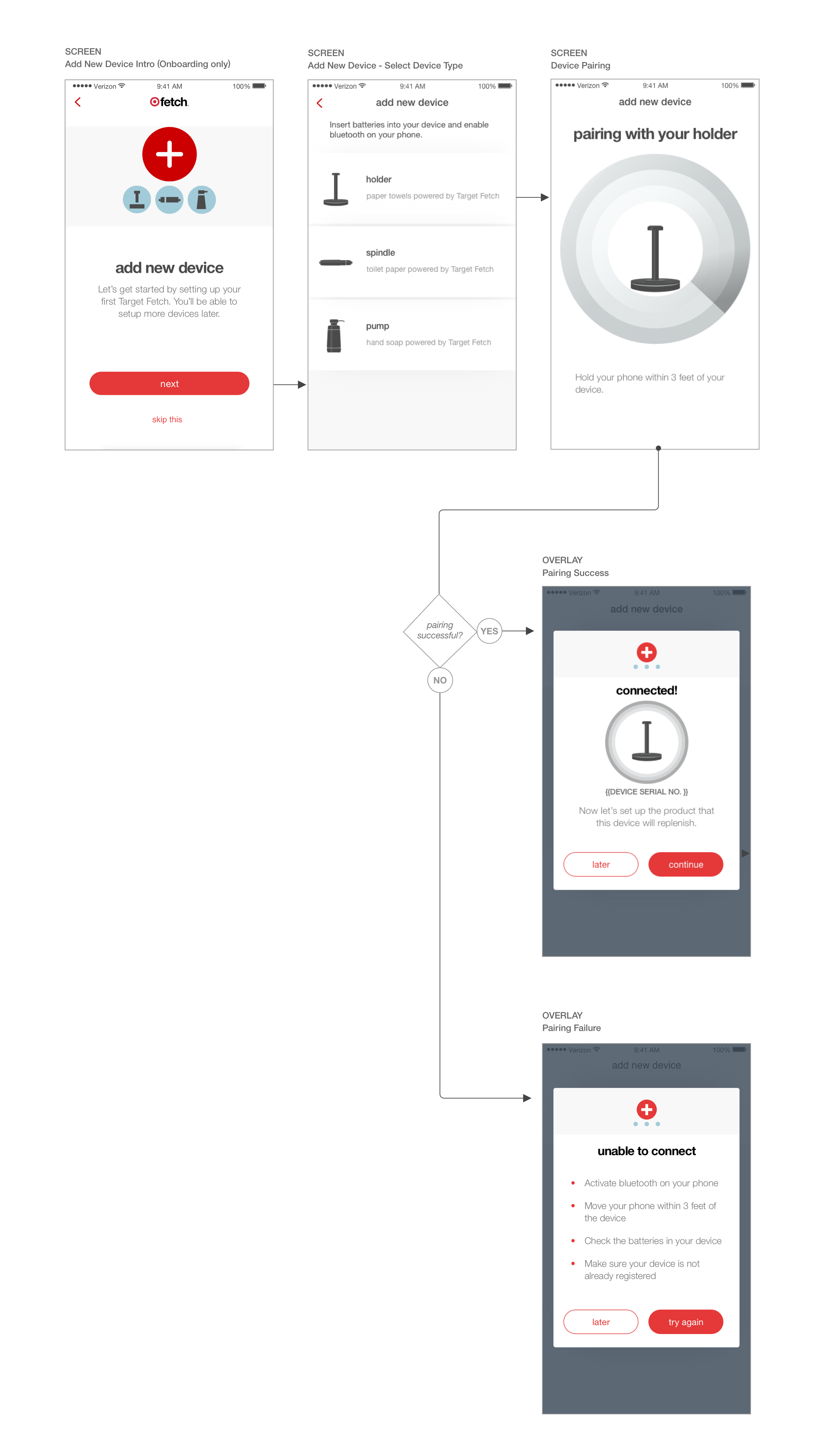
Device setup in the app begins with users selecting their device type. Once identified, the app shows a card with the device’s unique ID, information that can be verified on the physical device. If the app is unable to connect to the device during setup, an error message alerts the user and offers troubleshooting recommendations. From this point, the user may choose the product that will ship in their replenishment order, or they may set up another device.
Design Challenge: Helping users understand the state of devices
Once our first prototype devices were ready, we launched a 3-month, in-home study with eight families. We observed that the lack of lights, buttons, and other state indicators on the devices caused people to worry about whether everything was working.
| Solution 1: On-device feedback
Adding these indicators to the hardware would increase costs, so I found opportunities to increase transparency via the app and communication UX.
| Solution 2: Mapping device movement to the app
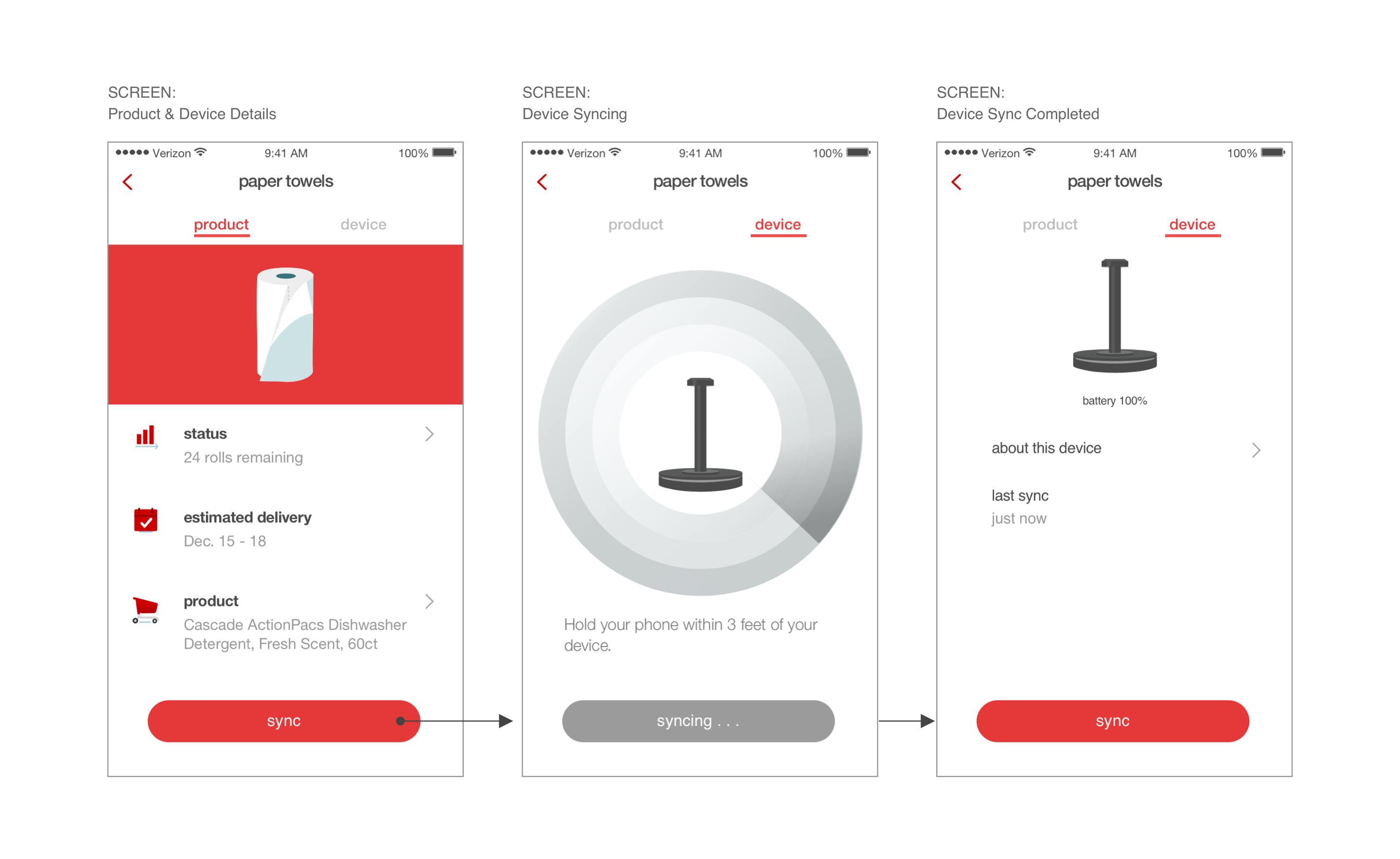
In order to preserve battery life, the devices were set up to send sensor event data every 30 seconds. At this interval, feedback from device interactions could not be perceived instantaneously in the app.
| Solution 3: Sync indicators
I made the most recent sync time visible on the device details screen, and I allowed users to manually sync with a button on the same page.
| Solution 4: Alerts
It’s important for devices to sync frequently with the app in order to maintain an accurate record of a user’s inventory, so in the event that a device hasn’t synced with the app in a while, an email will be sent alerting the user.
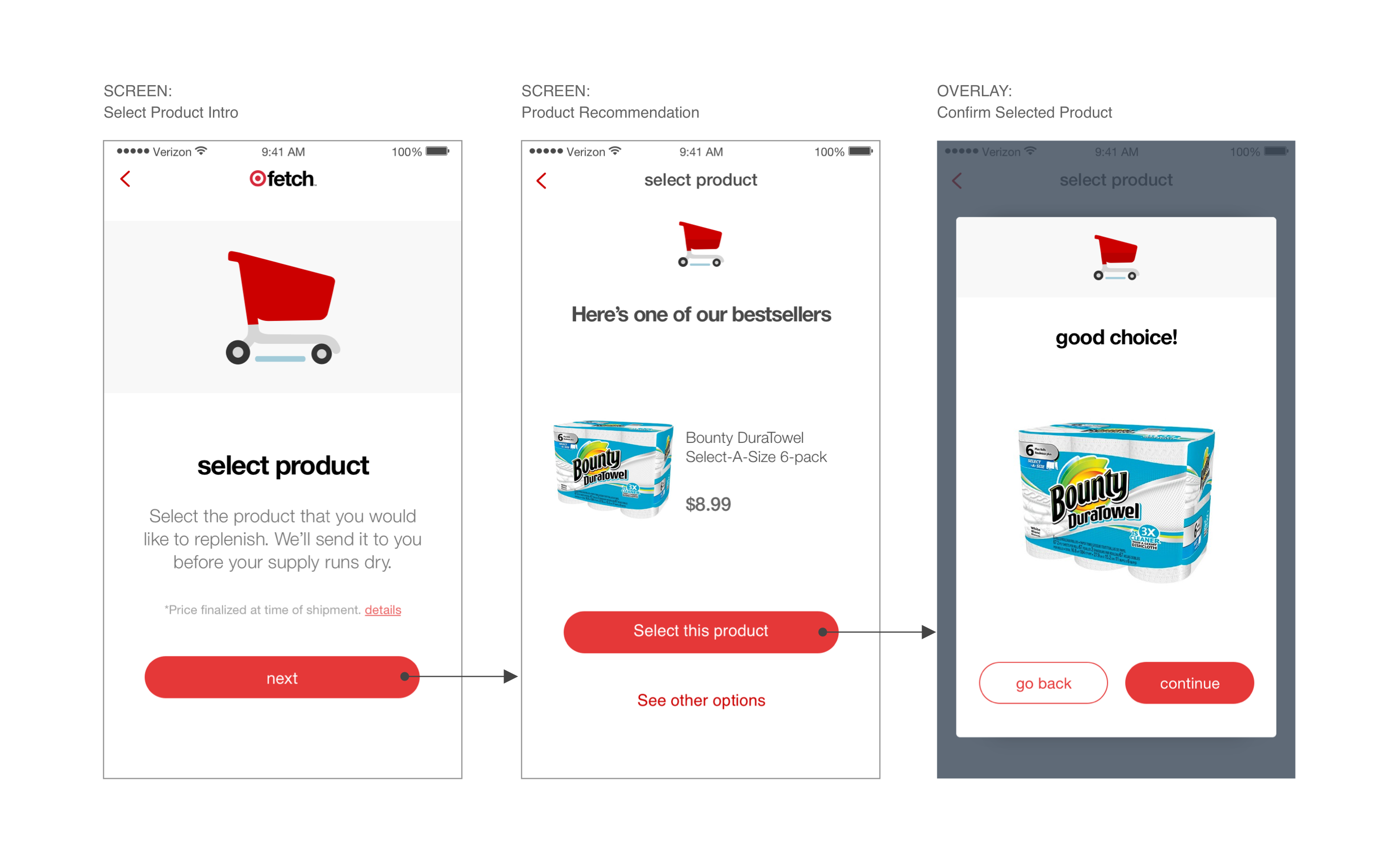
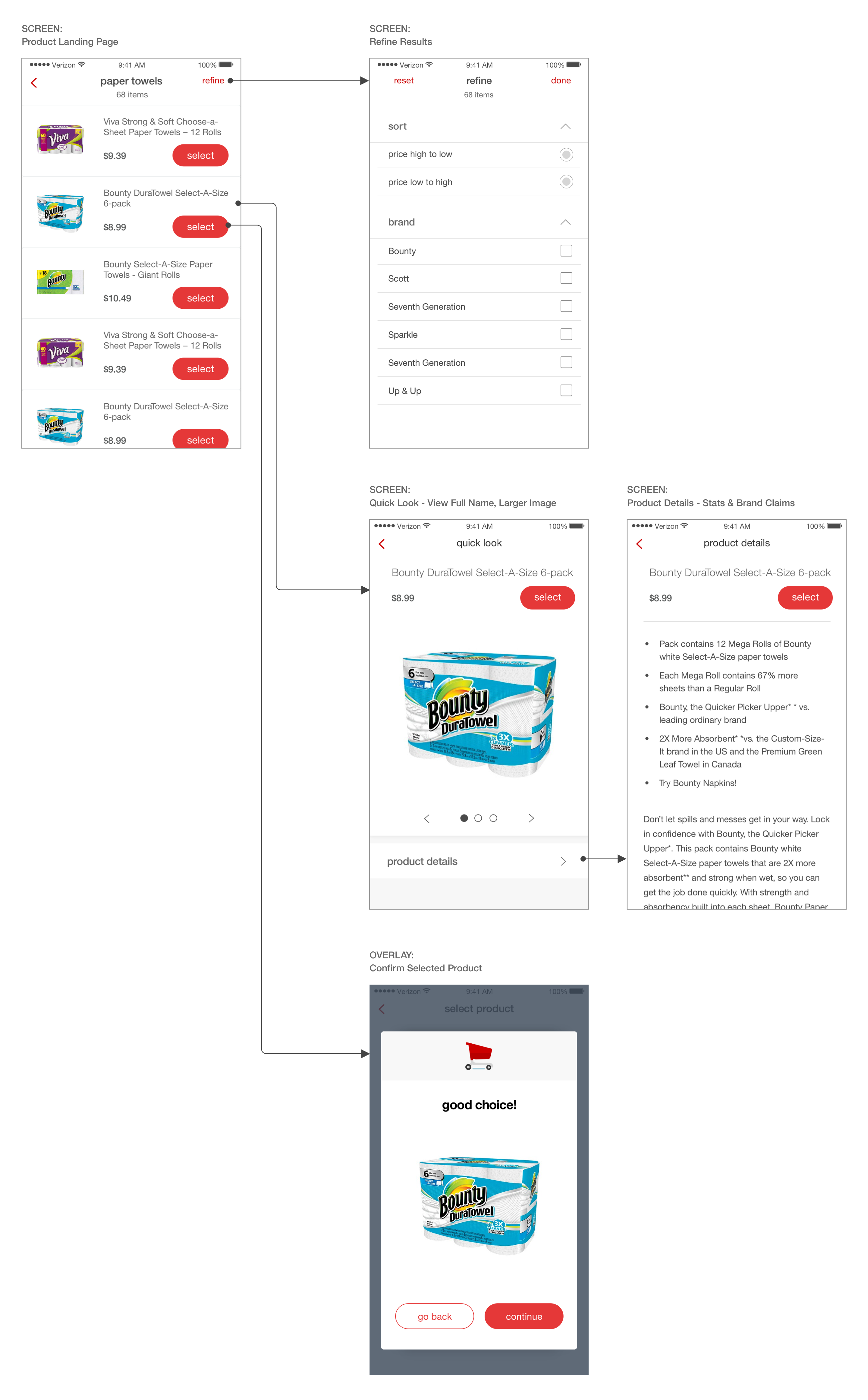
Selecting Product
After setting up their device, users select the product they want to be shipped. Users may select an option recommended to them, or they may view more options.
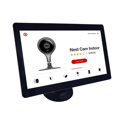
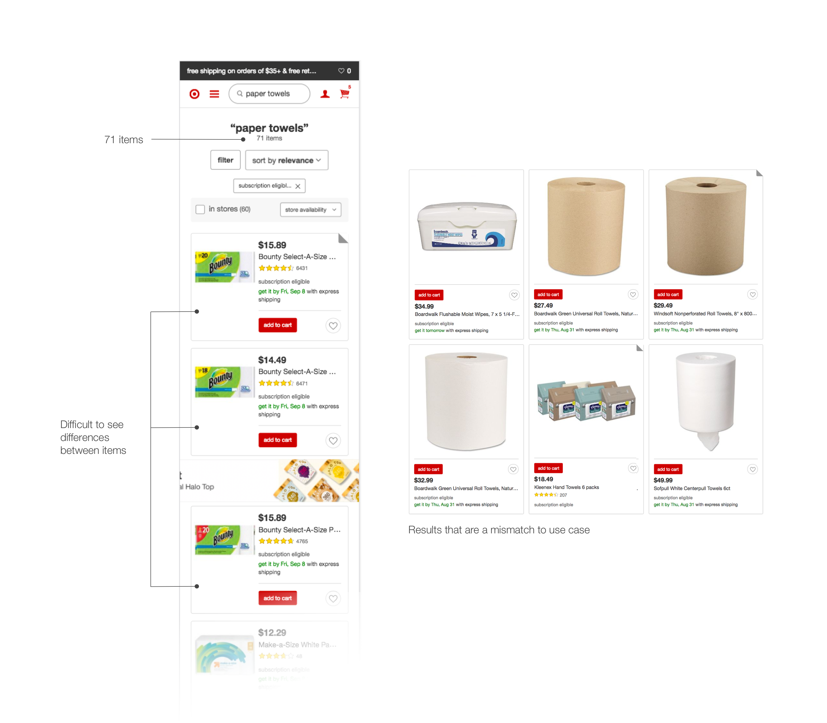
Design Challenge: Finding constraints in search
It’s possible to have dozens—and occasionally hundreds—of products within one essentials category, so tools to narrow the results are necessary. Unfortunately, at the time Target’s search API often included unrelated results in its responses, and the engineering team pushed back against the prospect of customizing a search solution due to the complexity involved.
| Solution: Discovering and structuring user needs
To validate what to build, I created paper prototypes and worked with my research colleagues to conduct a think-aloud exercise. Eight people viewed a mockup of the landing page and were probed on how they would find their favorite essential products.
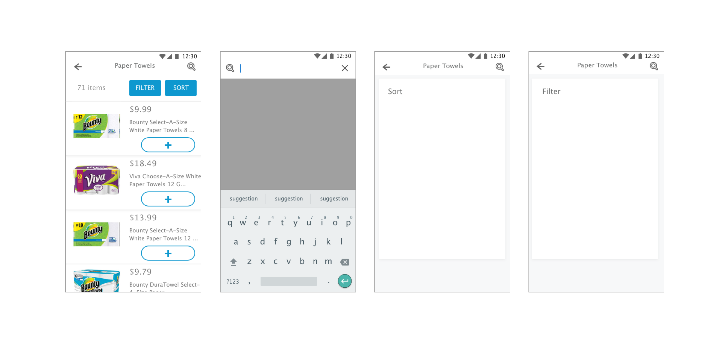
Five testers preferred filters, two preferred search, and one preferred sort; the most important considerations overall were brand, size, and sales. Based on these findings, I revised the UI to eliminate the search bar, enable filtering by brand, and use sort options to address pricing. I also made improvements to the presentation of product information, as lengthy product names and small photos were hard to decipher.
Product Status
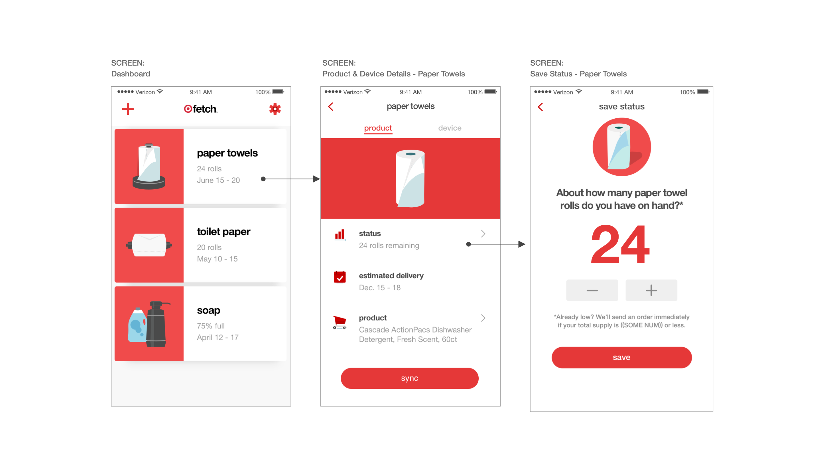
Proceeding to the Product Status section, users enter information about their inventory, which determines when an order is triggered.
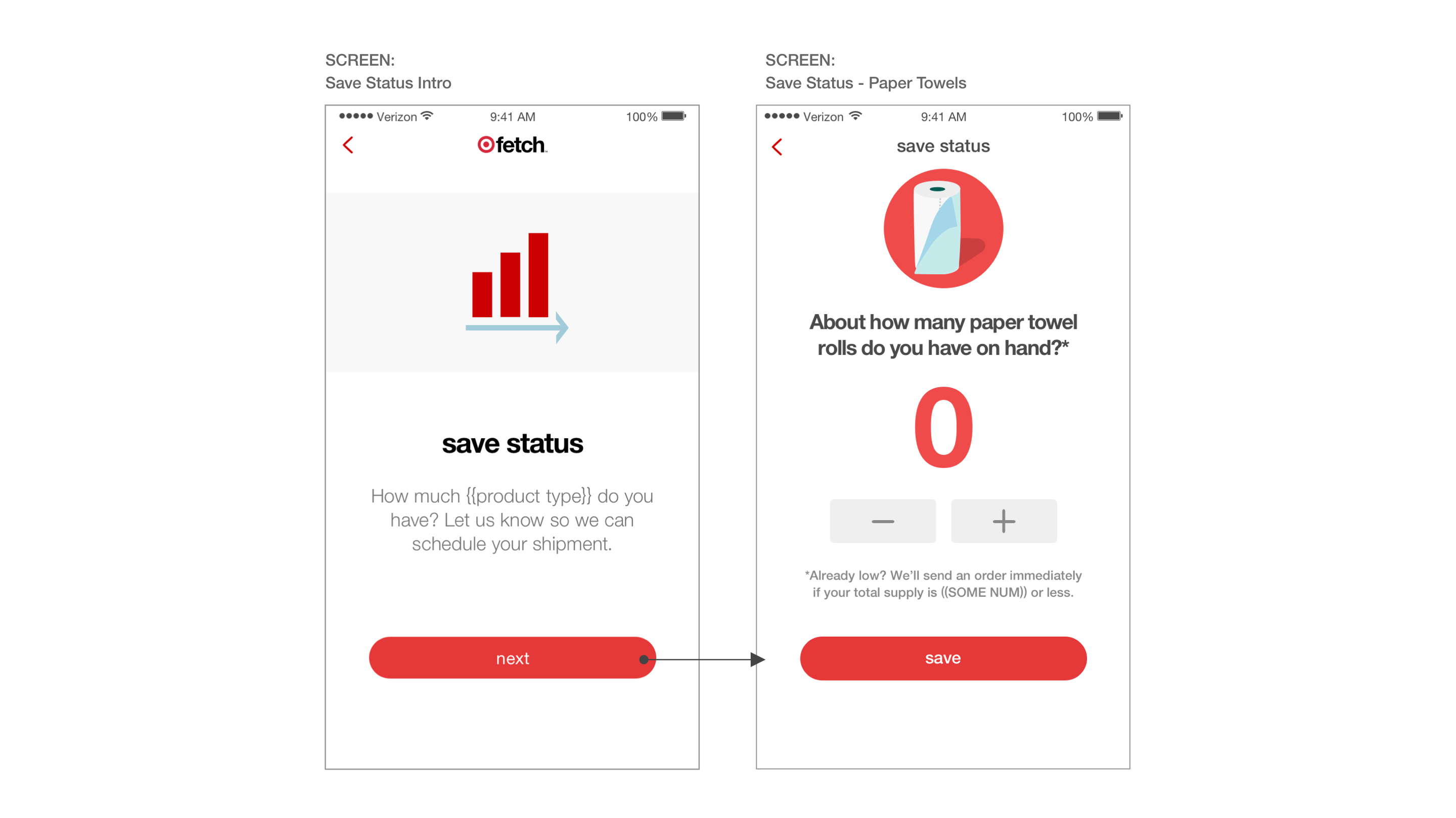
Design Challenge: Understanding inventory for different products
To ensure this section was clear, we did a study to learn how people described their stock and when they felt they needed to replenish.
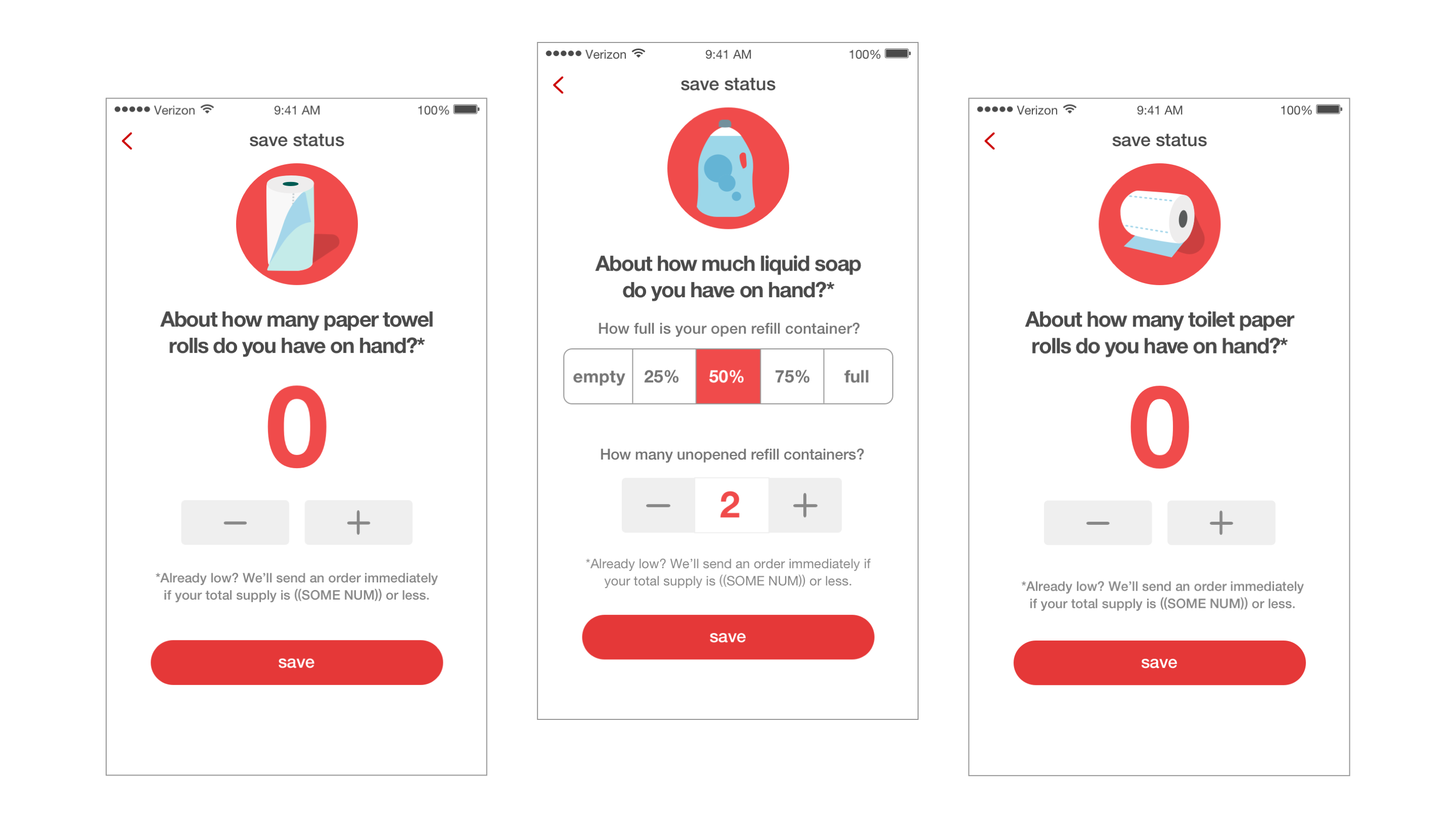
| Solution 1: Represent stock with appropriate granularity
When discussing paper products, people tended to refer to whole numbers, and when discussing liquid or gels like hand soap, quarters were the most common unit mentioned. The findings allowed me to develop standards for how status is entered in the UI.
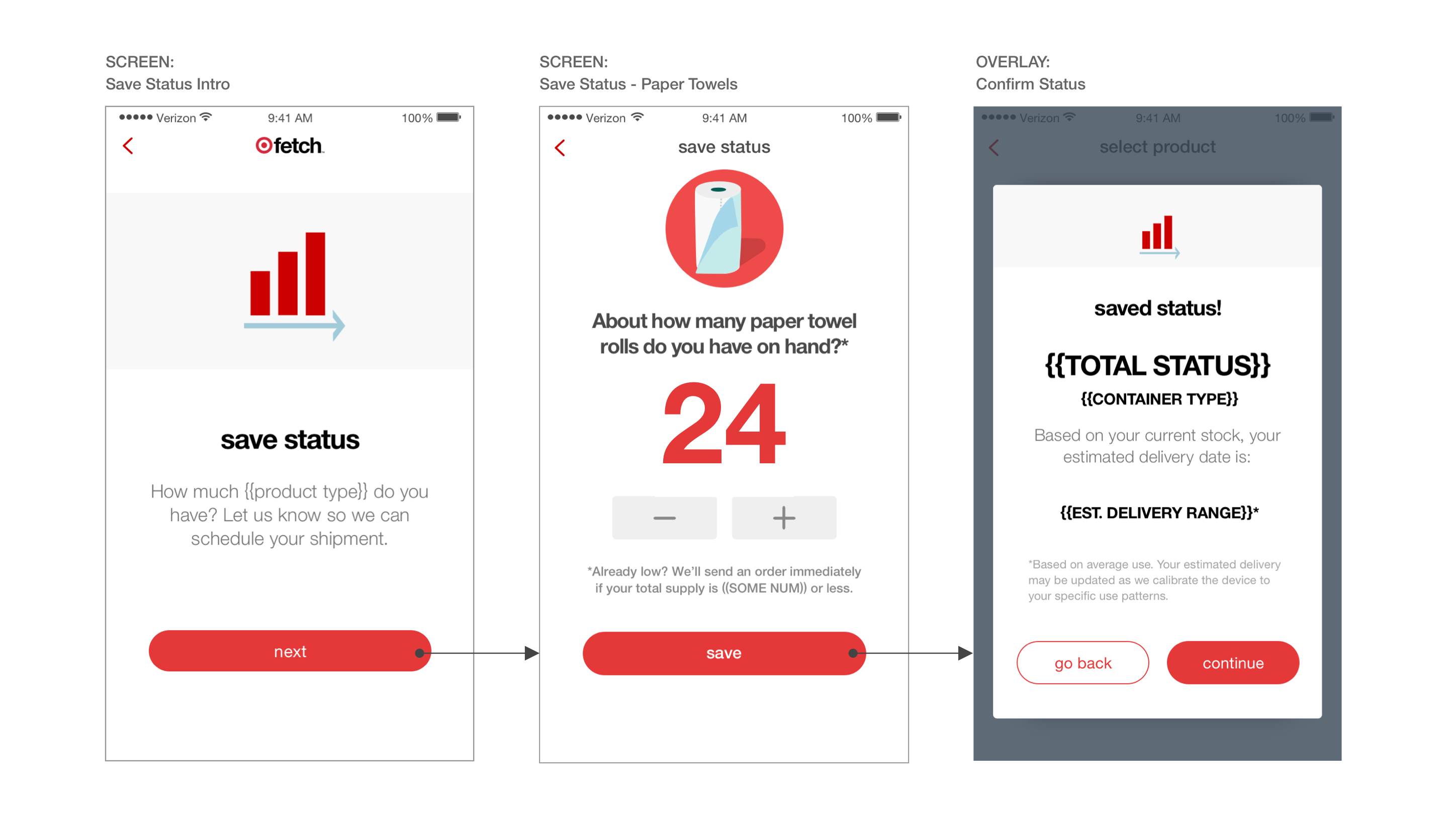
| Solution 2: Reassure people about running out
Though “running out” meant different things to different people, the product owner did not want to introduce custom triggers for reorder. At the same time, other research showed that users needed to understand the circumstances that trigger reorder in order to trust in the service. I addressed this by adding information about the baseline we used to reorder, and to further clarify how inventory levels corresponded to replenishment, I designed the status confirmation screen to show an estimated delivery date.
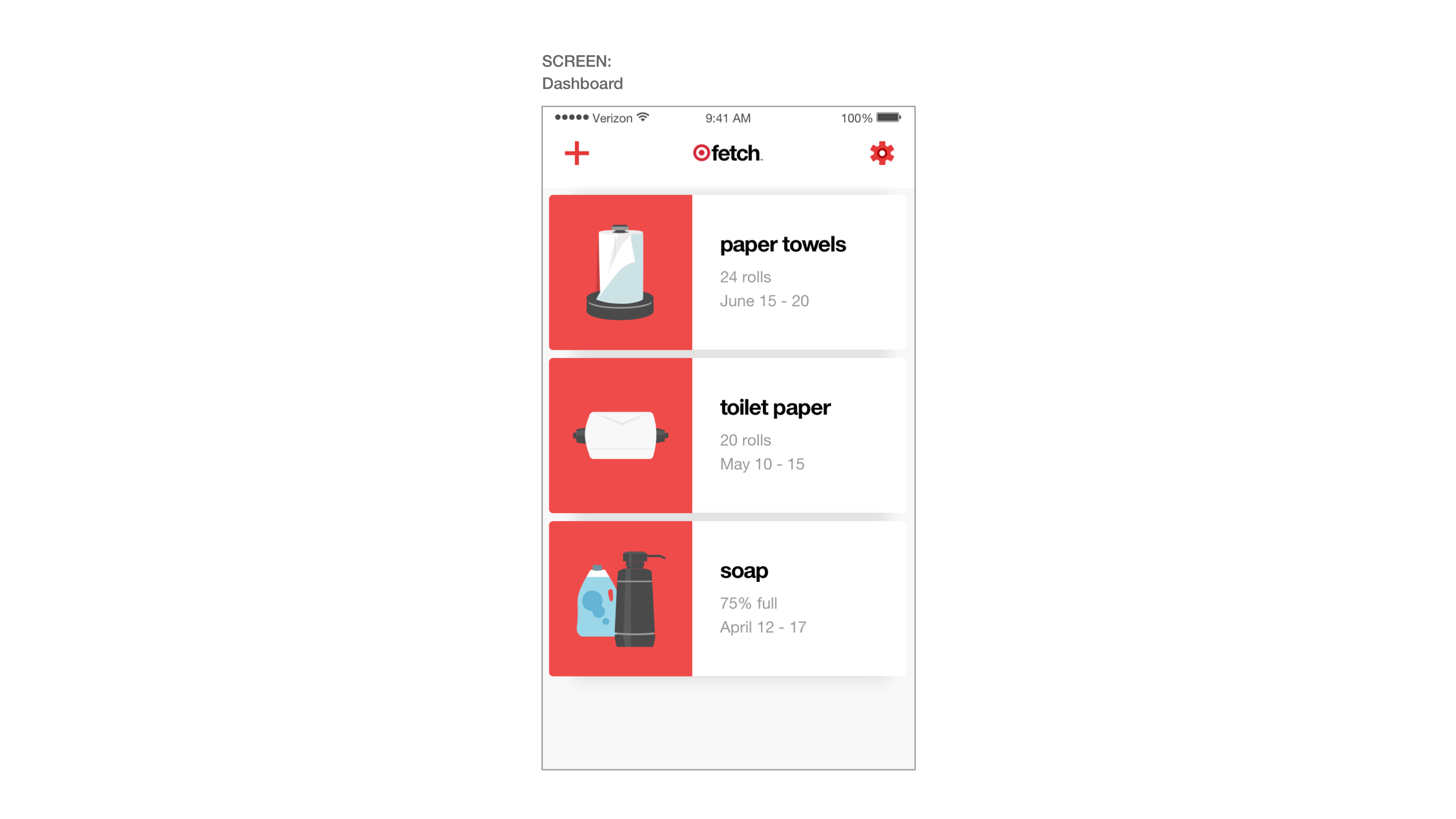
Dashboard
Users complete the onboarding process by entering their shipping and payment details. Upon returning to the app, they can view Fetch’s accounting of their inventory from the dashboard, which acts as the app’s home screen.
Design Challenge: Catching reporting errors
Anticipating that the product status might need to be calibrated at some point, I incorporated opportunities to finetune the readings.
| Solution 1: In-app status reports & updates
Tapping on one of the cards on the dashboard allows users to view a product’s status, upcoming order details, and device information. If needed, they can also update the quantity shown.
| Solution 2: Communication outside of the app
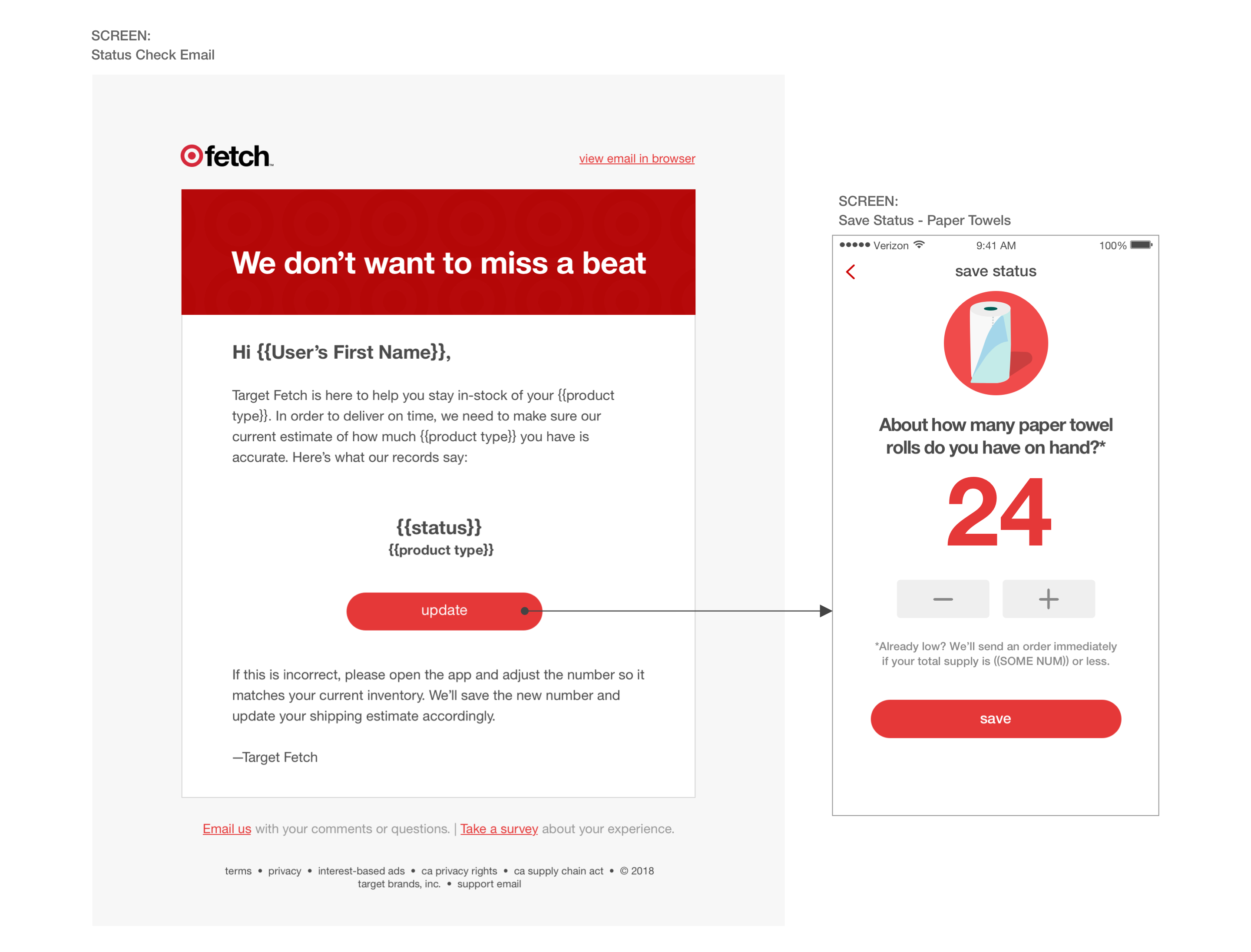
Additionally, I created a communication-focused user journey that proactively reports these measurements to users via email, helping them make adjustments as needed.
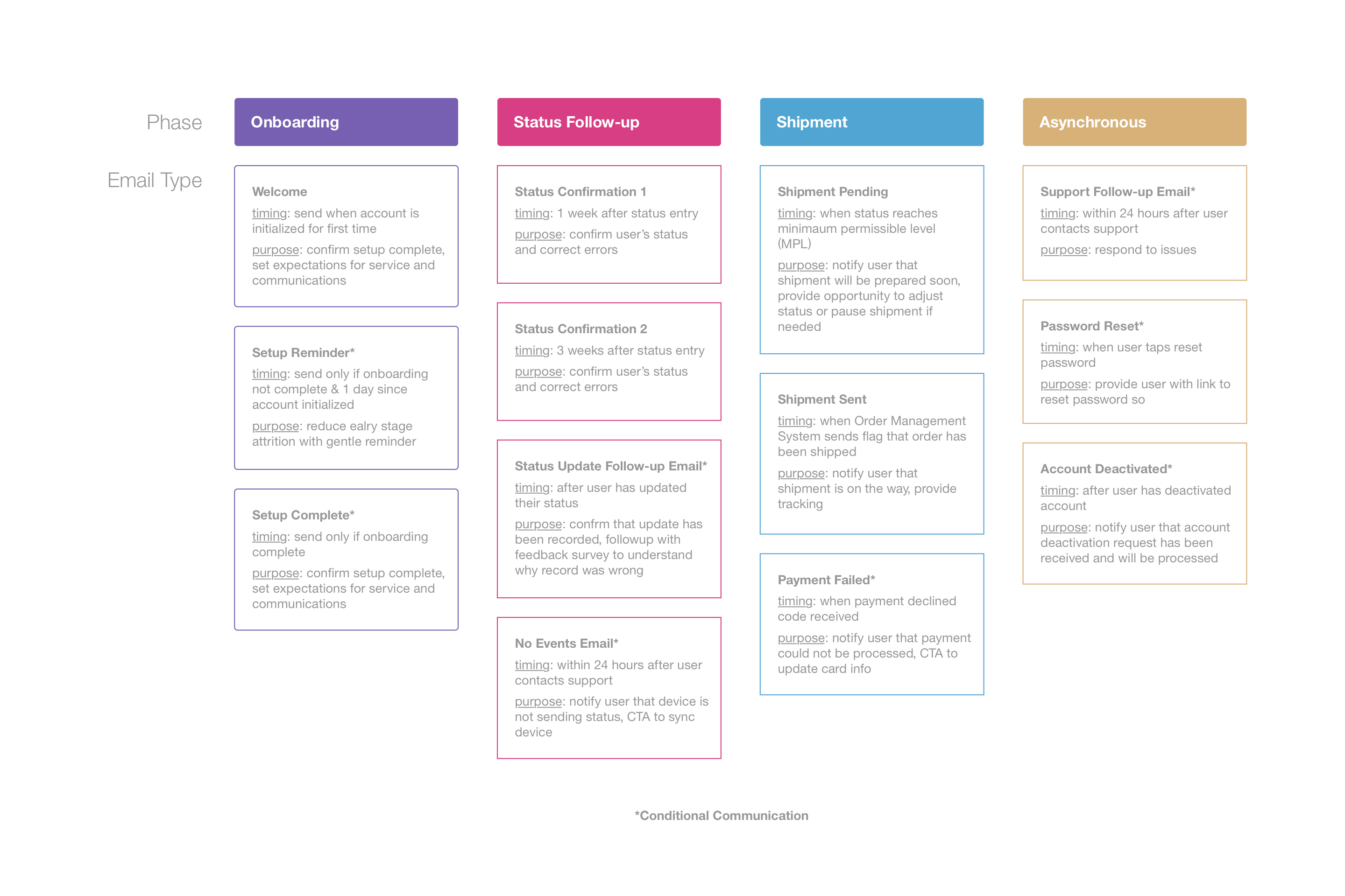
Emails and push notifications alert the user about 48 hours before a shipment is processed, enabling the user a window to cancel an order if the timing is off. One week after setup, users are sent an email showing the current status level on record, and if the number doesn’t reflect reality, users can choose to update.
Scaling
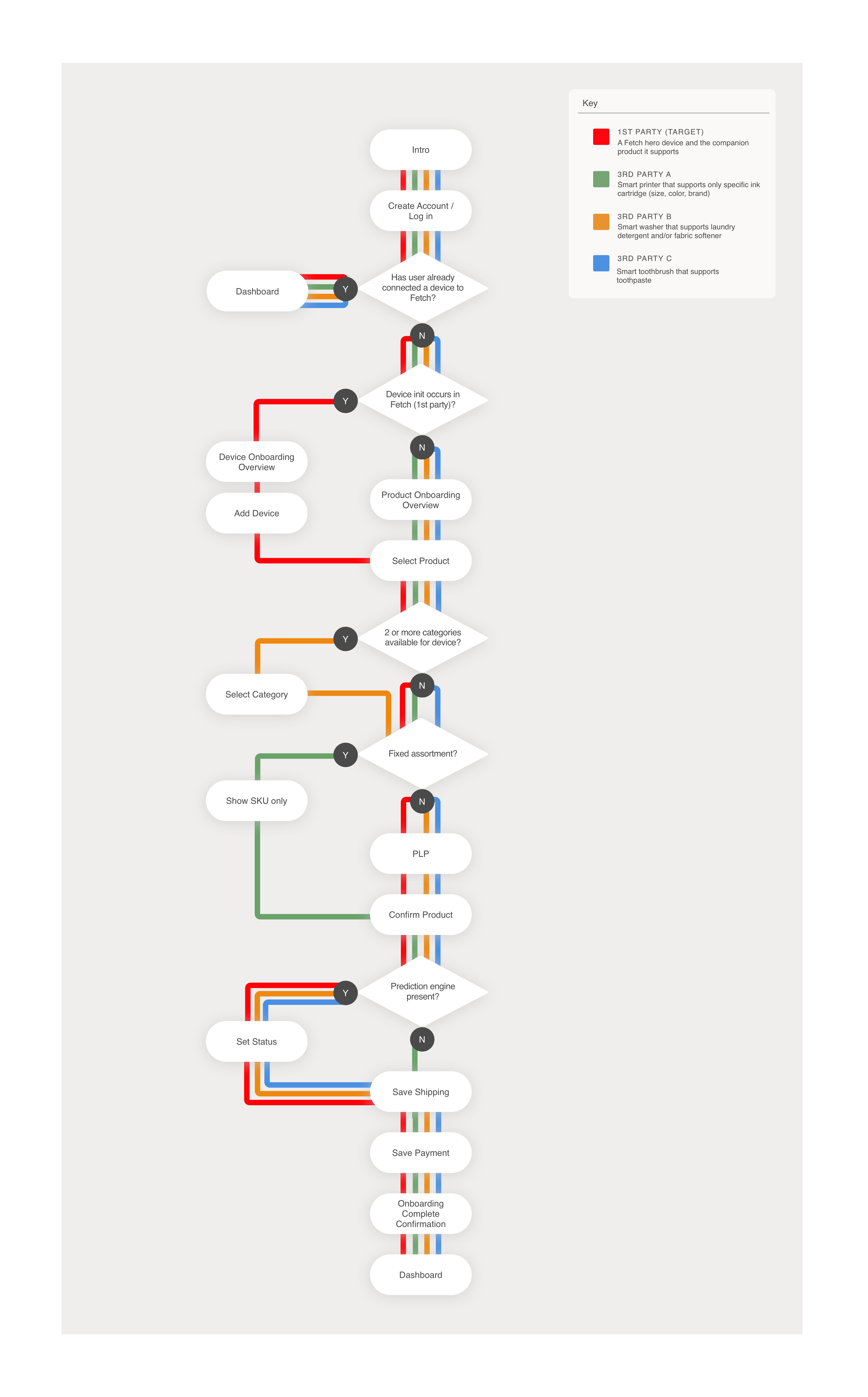
User research and business intelligence showed that subscriptions had the most value when several types of essentials were available. To make this breadth possible, the Fetch platform was designed to be flexible enough to support third party integrations with other smart devices.
Working with engineering, I outlined the different types of variables across the devices, essential categories, and SKUs Fetch could serve. The output of this collective brainstorm was my “subway diagram,” which helped the engineering team create modular components that could be swapped in and out as needed.
Learnings
Restocking essentials is the explicit purpose of Fetch, but the aspiration to reduce one’s day-to-day cognitive load makes the service compelling. One of the key things I learned in this project is that transparency and communication are just as important to earning users’ trust as fulfilling the value proposition of a product.