Open House
Enhancing engagement in-store with new product displays and content
Problem
Launched in 2015, Target Open House brings passers-by in downtown San Francisco a highly story-driven and interactive shopping experience. The store, which specializes in Internet of Things products, features an acrylic house where visitors can explore different use cases for smart products via short scenes that are projected onto the walls. A little over a month after the store opened, we noticed some recurring questions from visitors. People frequently asked, “Do these products really ‘talk’ to one another?” And a common follow-up was “So all the products here work together?” Our answers were “yes” and “well . . . sort of.”

Role
After working with researchers to interview shoppers and understand their knowledge gaps around IoT, I partnered with another designer to develop an in-store experience about using IoT platforms, the applications that help devices interoperate. I gathered content on product-platform compatibility, designed visuals for the in-store experience and a take home piece, and even helped install the final experience.
Background
In the following clip from one of the original scenarios, a fitness tracker powers down for the night, triggering the table lamps to turn out. One can see how visitors were confused about how everything worked, seeing as the speech bubbles above the products reinforce the idea that they "talk" to one another independently.
IoT platforms link products together and enable the scenarios shown in Open House, but this component wasn’t explicit anywhere in the store. We remedied this by creating "The Garage," a separate section of the store that allowed visitors to practice routines similar to those on display in the main areas of the store. Being more familiar with the platform landscape, my design partner suggested which apps to display, and I cross-referenced each app's supported products with the assortment available in the store. Below you can see me mocking up this experience on a surface that one colleague jokingly referred to as the design department's "Montessori corner."

Physical UX
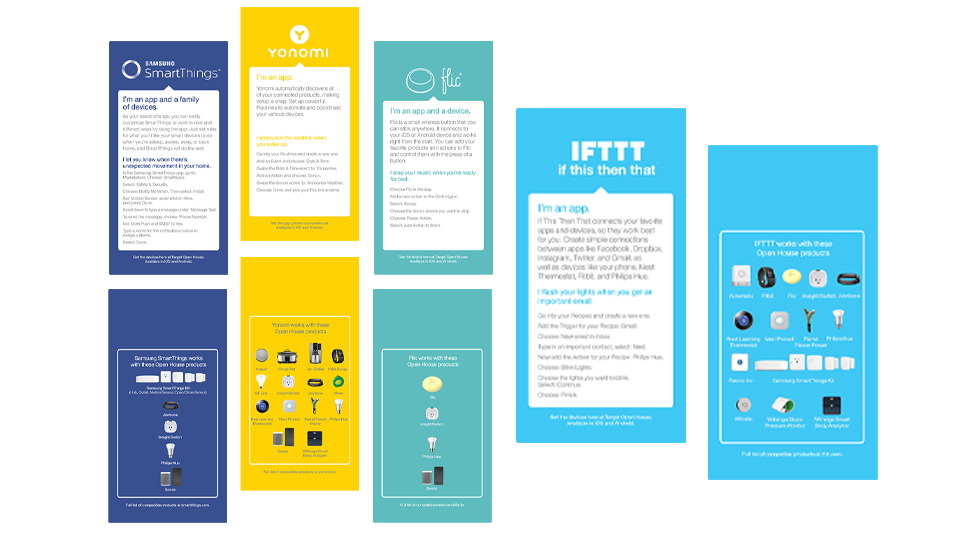
There are numerous IoT platforms available to consumers, and the six we selected represent the range of possibilities. Some highlighted that the technology can be as simple as the tap of an app (IFTTT, Yonomi, Muzzley) or a click of a button (Flic). However, others involve a little more complexity in required proprietary devices and hubs (Works with Nest, Samsung SmartThings). My design partner hosted a short platform workshop in the store, which was vital in helping us determine how to explain the set up steps.
Each platform in The Garage was set up at a station that featured a short summary of the platform, the platform’s app, up to four devices, and a walkthrough for two scenarios. Additionally, we created a booklet illustrating each platform and the full list of Open House products it supports.

This project—and Open House in general—allowed visitors to test out so many possibilities, and it’s been gratifying to see IoT novices and experts alike make new discoveries in the store.


