Unison
Interface to help in-store shoppers understand products
Problem
Shopping for smart products can be intimidating. Research with shoppers in this category revealed a few of the reasons why this is the case:
- Opaque purpose or requirements
- Paradox of choice presented by so many options
- Lockboxes that obstruct information on product packages in-store
Some intrepid colleagues of mine decided to address these hurdles by developing Unison: an in-store, digital interface that presents product information to shoppers, enabling them to evaluate their options and purchase with confidence.
Role
I was brought onto the project to help it scale from pilot stage—a handful of products shown on tablets in 5 stores—to a full launch—30+ products on tablets at 800+ stores. As the UX Lead I created and tested flows with users, guided the structuring of content, collaborated with engineering to find solutions that fit within the existing tech architecture, and worked with internal stakeholders from in-store marketing, site content, and merchandising to ensure the experience was aligned with Target’s brand voice and business goals.
Background
The interface was designed to fit 10” and 15” tablets located next to product displays. Prior to this, product information in-store existed on print product cards that had to be approved by vendors and merchants, created by designers, delivered to stores, and set up by the store team. The digital interface, however, allows for deeper, dynamic content such as photos, reviews, videos, and more—and all of it can be deployed at the push of a button.

In the preliminary interface, each product had a dedicated tablet displaying its info. While this was reasonable when dealing with a couple dozen tablets, our launch plan expanded both the number of products and stores, so if we kept the original UI and IA, we would need 5x as many tablets per store or 25,600 total tablets! To stay on budget, we needed to stay at an average of about four tablets per store, which meant I had to revise the UI and IA to show multiple products on one tablet.


Awareness: Making purpose clear from the start
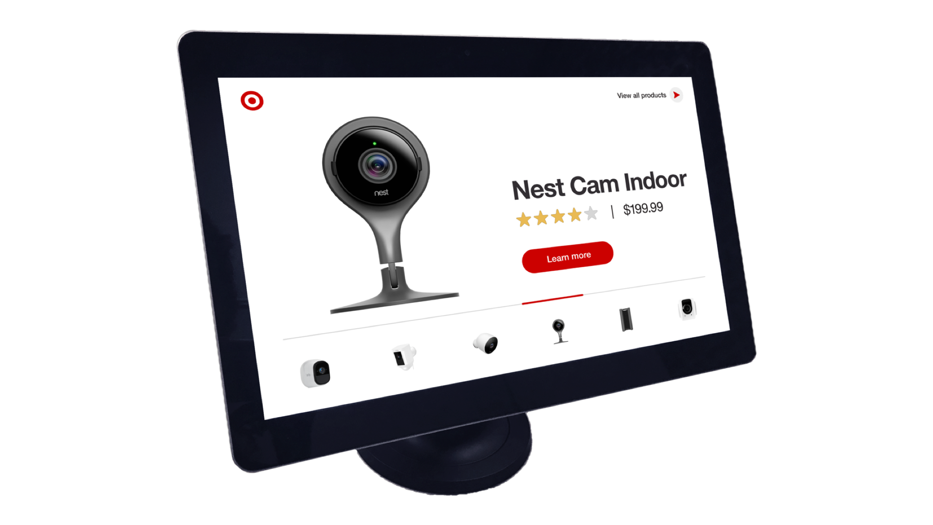
Taking aesthetic cues from the original design, I created designs for an A/B test to understand what type of content helped users enter the experience. As in the original, the “A” version lead with the products’ hero images and logos. The “B” version also included these elements and expanded on them, adding price and a short description to the picture.

Many smart products don’t reveal their use at first glance, and even people who owned 5+ smart home products had difficulty guessing the function of unfamiliar items in the “A” version. Some users were puzzled—and even slightly intimidated—by the absence of price; one user remarked that this made her think the items would be too expensive for her, which discouraged her from engaging.
On the other hand, the added details in the “B” version gave users a sense of where to begin—even when they were looking at products from lesser-known brands, which is a crucial step to feeling more confident in exploring an unfamiliar space. It was clear that users preferred the added context shown in the “B” version, and the researcher leading this test made the recommendation to further differentiate the products in the attract loop by incorporating reviews and a product summary.
The next version of the attract loop would have to showcase much more information and still remain legible. To do this on a 10" display, I leveraged animation and transitions to establish a hierarchy in introducing each product.

Designing for Snackable Details
The primary categorization scheme includes Details, Reviews, Video, and Related, each of which are broken out into respective pages that are accessible from the bottom menu. In the initial UI, information on each of these pages was unstructured, which presented a challenge when it came to finding the right product.

During testing we heard people articulate the same concerns again and again:
“I don’t know if I can set this thing up.”
“Does this one work with a Google phone?”
“The reviews [shown in-store] are probably only the better ones.”
The lack of organization was also a hurdle to content managers inputting product information, as they had to guess which specs to include in our limited interface. There was a clear need for standardized content to address these questions and doubts, and given the in-store context, it was best for answers to be gleaned quickly.
In my revised UI, I added headings and submenus to help people scan and parse page content. The new guidelines for type and format of content streamline the processes of creating and searching for content.
Compare: Designing for evaluation
While the above features helped deepen understanding at the product level, users also needed to make comparisons at the category level. I identified a range of experiences, both guided and exploratory, aimed at serving this need. These included a traditional comparison table where users see attributes of all products; a table consisting of a maximum of three products that are chosen by the user; a filter-based UI that highlights products matching selected values, and a recommendation-based experience that provides options based on a user's responses to a questionnaire.

Upon testing these concepts with users, we discovered that filtering was the most well-received. This concept resonated well because users could easily scan and select granular attributes. Somewhat surprisingly, a majority of testers found that interaction design of the filters supported their learning. When activated, filters toggled the opacity of products; matching results became brighter and more dimensional, whereas mismatches dimmed and appeared flatter by comparison.

Learnings
Another round of testing was done in-store after our full launch. We learned that the content of the experience was spot on, and users had relative ease navigating the experience. However, discoverability of the tablet was a problem, which was something I anticipated since it was in the electronics section and therefore could be mistaken for a saleable product. This is currently being addressed through a new, branded attract loop.


