Homemade VR
Leveraging VR to help people see how home products might look in their space<
Problem
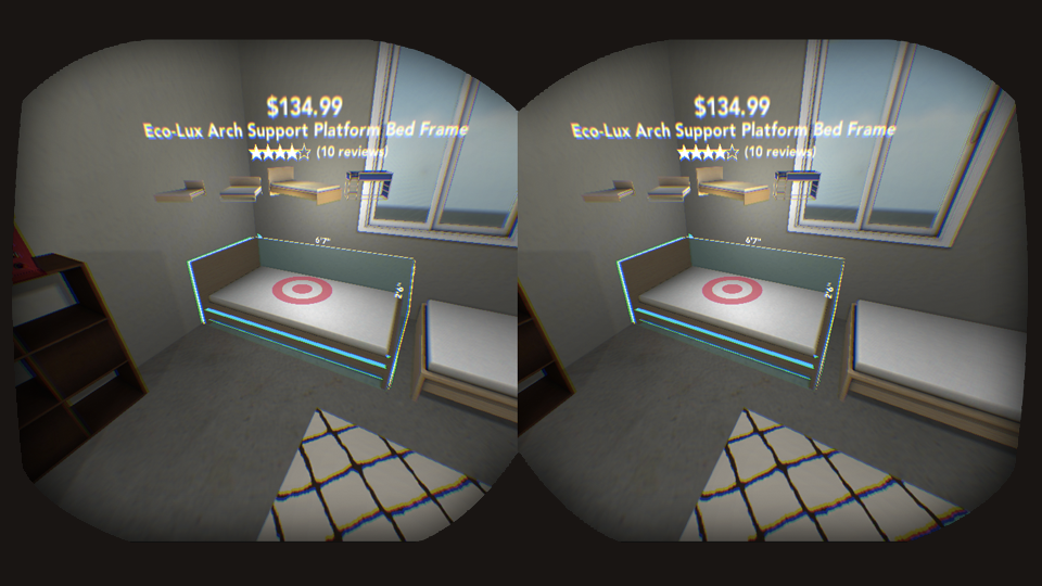
During my graduate student internship for the Target Technology Innovation Center, my cohort of four interns had a single goal: design a VR experience for Target. Our answer to the challenge was called Homemade, an app that allows users to shop home goods from Target.com in a VR replica of their room.
Role
Aside from a childhood infautuation with Virtual Boy, I had no prior experience with VR. To bring myself up to speed, I tried many VR experiences, assessing the opportunities and limits of interactions in virtual space. At the same time, I engaged with the business priorities at Target to gather insight on where this opporrtunity may intersect. Exploring both the technical and business landscape helped me arrive at a home decor-based opportunity, which I pitched to my fellow interns, who were onboard with the idea. As the sole UX person working on a team of talented engineers, I led the information architecture as well as the experience, interaction, and interface design, collaborating with my colleagues along the way.
Background
As students, my intern cohort was familiar with limited budgets, cell-like living spaces, and awkward furniture that would never be the right size for our needs. Target’s assortment of affordable, stylish furniture, already improves upon the first two issues, but when VR is added to the mix, a user no longer has to rely on estimation or imagination to see how an item will fit into her home. Once we landed on this idea, I began outlining the IA and storyboarding the user experience.


During our prototyping process we experimented with several types of interaction, including a Wit.ai-enabled voice interface, a Nintendo Kinect sensor that offered gestural controls, computer keyboards, and a new controller designed for VR from the startup Sixense.

Each of the options we tested had its challenges. At the time, the voice technology had difficulty recognizing different accents. We also ran into other common voice interface problems such as matching synonyms and building on the context of the user's most recent query. Gestural controls seemed promising, but it was difficult to map the data coming from the controller to the z-axis in the VR world. Computer keyboards felt too tethered to the physical world, and some users found it challenging to maintain proper key positioning while they were wearing the headset. Sixense's controller, which was still being prototyped, was more fluid than the other options, but we were unable to obtain one for ongoing testing.
In the end we went the classic route and decided to use a game controller, because it was the accurate at capturing user actions, inexpensive, and easier for a user to operate while in a headset. I specified actions for the buttons with the goal of easing recall for the user; spatial movements were reserved for the controls on the left, while the right side enabled users to switch contexts.

Working on this phenomenal UX/UI design challenge proved to be one of my favorite undertakings yet. Have a look at the video below, which shows a user measuring, arranging, shopping and updating his furnishings real-time.


