Vendor Dashboard
Helping vendors contextualize product performance with in-store shopping metrics
Problem
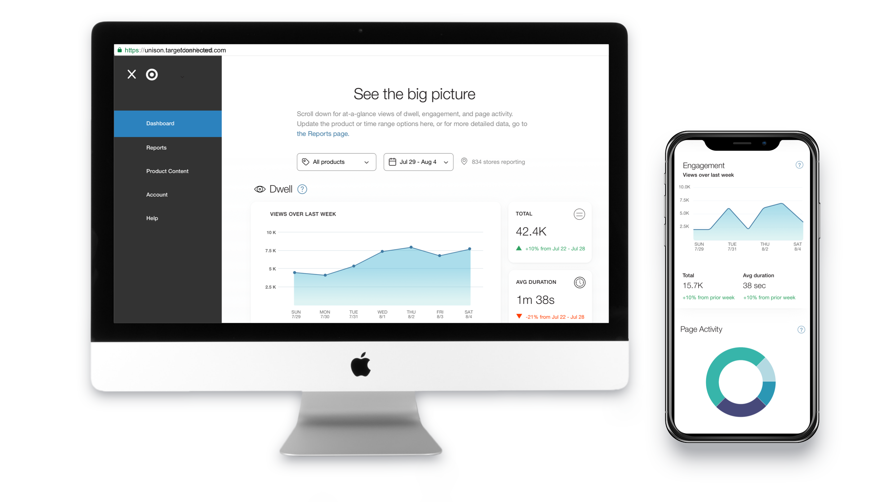
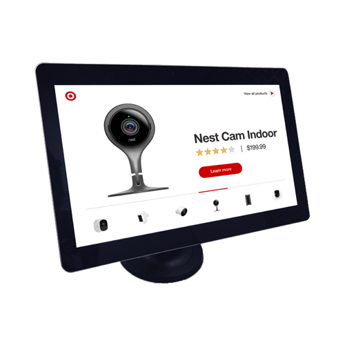
Web and app analytics are standard reference points for retailers wanting to understand customer experience in the digital domain, but matching this level of insight in brick-and-mortar stores can pose a challenge. However, with the advent of digital tools that assist shoppers in-store, businesses now have a platform from which to observe shoppers’ product interactions in the aisles. Our team developed tools to capture, parse, and present activities from an in-store interface into an online dashboard and spreadsheet data set.
Role
As Lead UX Designer for this project, I worked with our engineering team to identify opportunities to collect data from our in-store interface and understand how data was being transmitted and interpreted on the back-end, so that our UI could reliably render data. I also worked with vendors to identify and address their information needs.
Background
The intended users of the data are Target’s vendors marketing products in the smart home category. Interviews with this group helped us identify their objectives:
- Know how many people are seeing my product(s) in store, so I can understand the relationship between store traffic and my sales
- Know which content people view most in-store, and optimize content strategy accordingly
- Understand whether one version of content is more compelling than another
- See if there are correlations between in-store content and sales of my product(s)
- Unearth patterns that may improve planning, sales projections, etc
Content strategy was a large part of vendors’ interest in data, as such, the dashboard is situated within the portal where vendors upload content for the in-store interface.

Although sales data was also important, our team was prohibited from including this information in our dashboard and reports. Fortunately, vendors had a separate access point for that data, and they were happy to triangulate these points independently. Going forward, our focus would be on communicating consumers’ shopping journey from discovery onward. To do this, the team and I applied a common retail framework called the sales funnel, which helped us outline opportunities to capture relevant data from the in-store interface.


"Awareness" relates to how consumers discover products; here, it is equivalent to impressions. "Interest" describes when shoppers enter an experience, and it can be measured through interaction with the attract loop. "Decision" is the process of winnowing down options and focusing on the product(s) with the most potential, and reflects page traffic from those who follow a call to action to a product's details page. Finally, "Action" typically describes the purchase and post-purchase states of the journey.
Selecting Data Visualizations
With the data types defined, I began exploring appropriate visualizations. I needed an accurate sense of how the graphs would appear, so I designed the visualizations using a real data set. Doing so allowed me to account for changes in independent variables, such as each vendor's number of products, which ranged from 1 to 5 at the time. I was also able to see how dependent variables — e.g., the different types of user actions and metrics — were impacted.

Testing with subject-matter experts showed that there wasn’t a one-size-fits-all approach to visualizing metrics. For example, since the metrics already follow the sales funnel, they will always have the same scale relationship – e.g., Awareness will always be much larger than Interest. Changes become more apparent, however, when the two are visualized as a time series, allowing vendors to compare the shapes of each graph. Page traffic, on the other hand, is most useful when a rank can be determined, as this helps vendors prioritize their content strategy. I incorporated this feedback into the final visualizations.

Digging Deeper: Filters, Metadata, and Reports
Latency was a huge issue due to the size of the data set, so only one product option could be shown at a time, and dates were fixed to the most recent business week or business month. As an effort to ground the visualizations in a historic trend, I included deltas showing how the current week or month compared to the previous period.

Reports page
While the dashboard is a helpful first step in visualizing data, it was essential to permit users to independently explore data and combine it with other sources. The Reports page archives weekly data at the individual product level so that vendors could delve deeper. With the help of a master Excel user, the team and I defined a spreadsheet structure that built upon the metrics shown in the interface, adding greater granularity for data manipulation.

Learnings
Each of the vendors I interviewed and tested prototypes with emphasized that data needed to be contextualized and appropriately granular in order to be actionable. While I believe our team achieved this, I would love to enable more customization for users— for example, the ability to select more than one product to appear in the visualizations, or an option to brush data to zoom into specific dates, or a section that helps vendors see how variations of content are performing. Stay tuned for


